Painting at the Charles H. Cecil Studios

I have just completed a short course at Charles H. Cecil Studios in Florence (Sept 2015).  The teaching in Florence is based on a tradition called 'sight-size' where the drawing or painting is seen to the scale of life alongside the model.   Alongside this set up, we were rigorously using optical devices - a small  mirror, or a black mirror, in order to judge and capture edges accurately.  It is thought that artists had started using mirrors as early as the 1500s.  Our eyes constantly trick us, so we have to consciously train ourselves to dilute that subjectivity. 

The sight-size method also requires you to stand back from your model, as your canvas is placed directly next to the model, and your painting becomes that image which you are observing from a distance.  This technique therefore requires good visual memory too, as you are constantly moving back and forth, from observing, to making the marks on your canvas, to then going back and observing them again. The benefit in standing back lies in flattening the 3D image that you are trying to translate, and seeing the form more objectively, as opposed to getting caught up in detail and irrelevancy. 

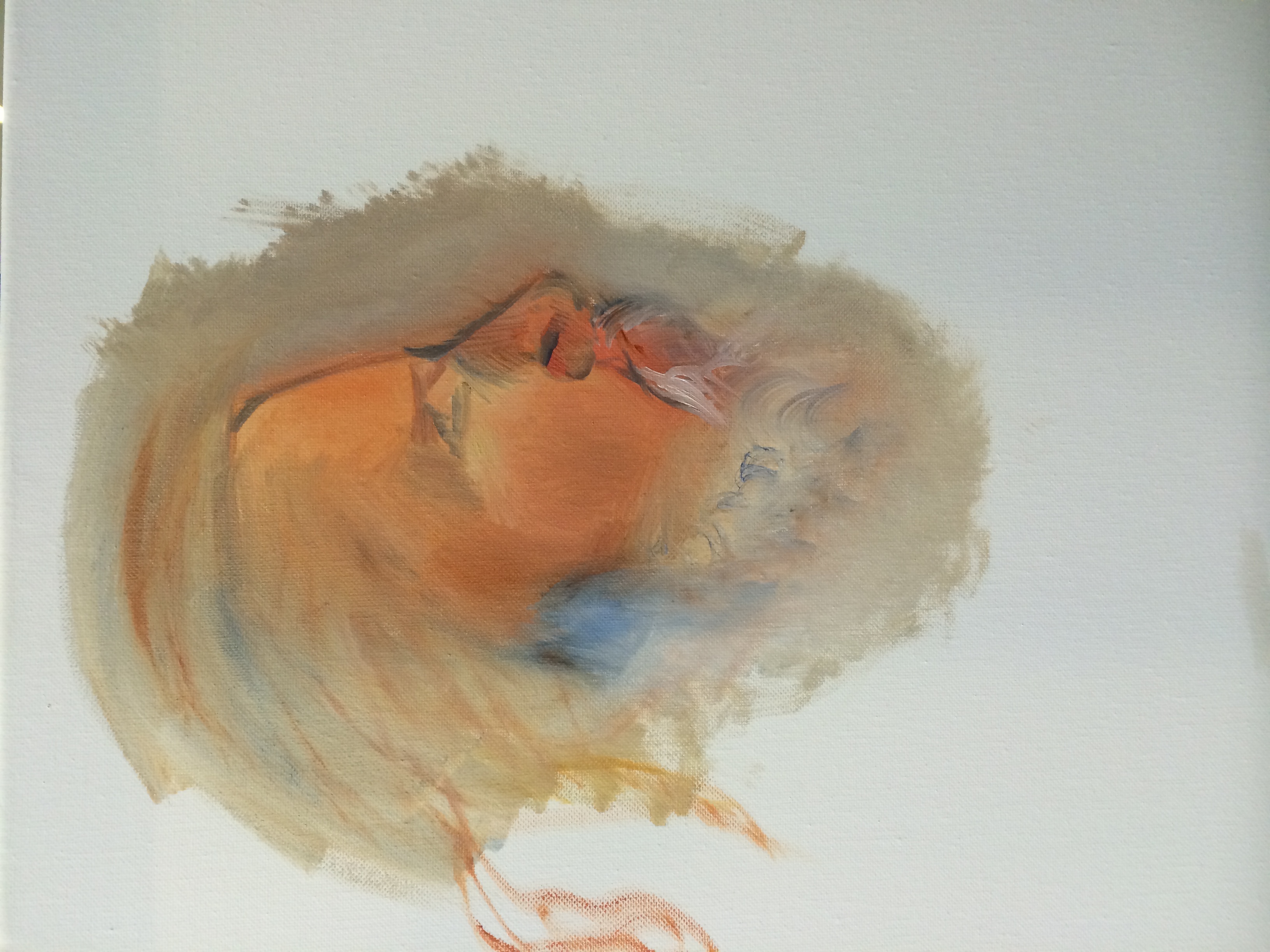
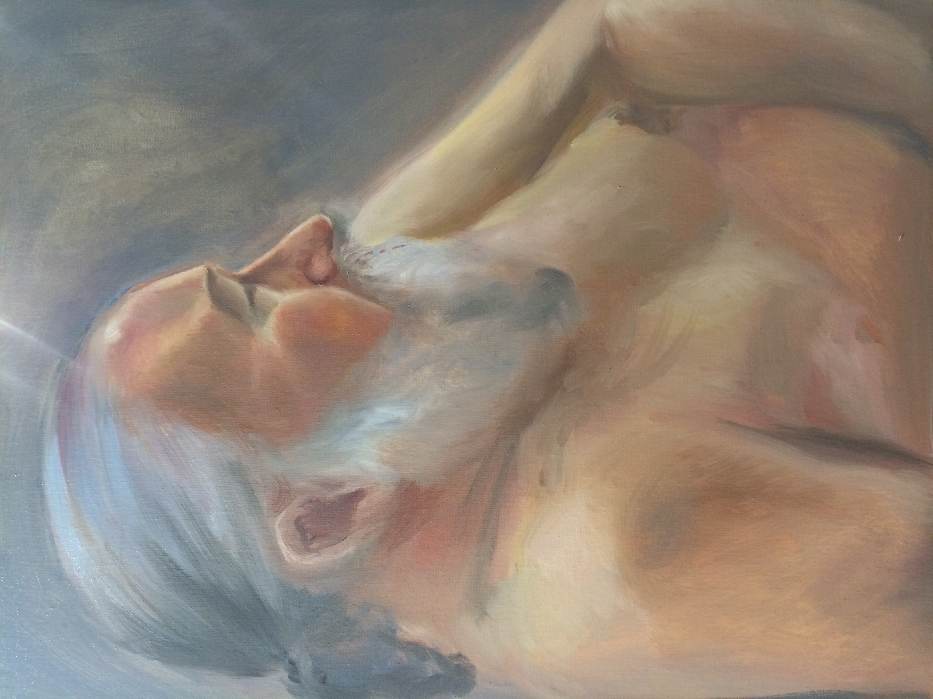
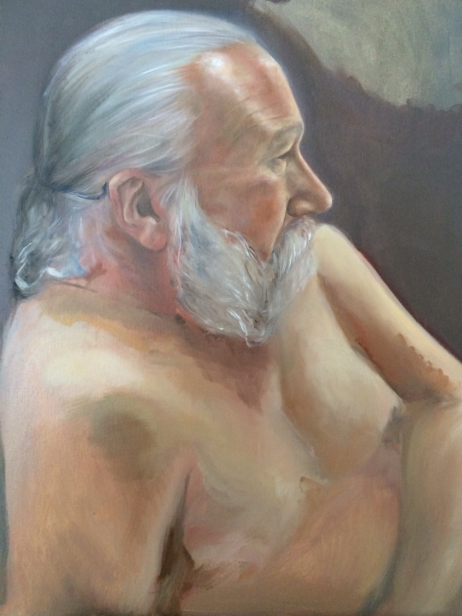
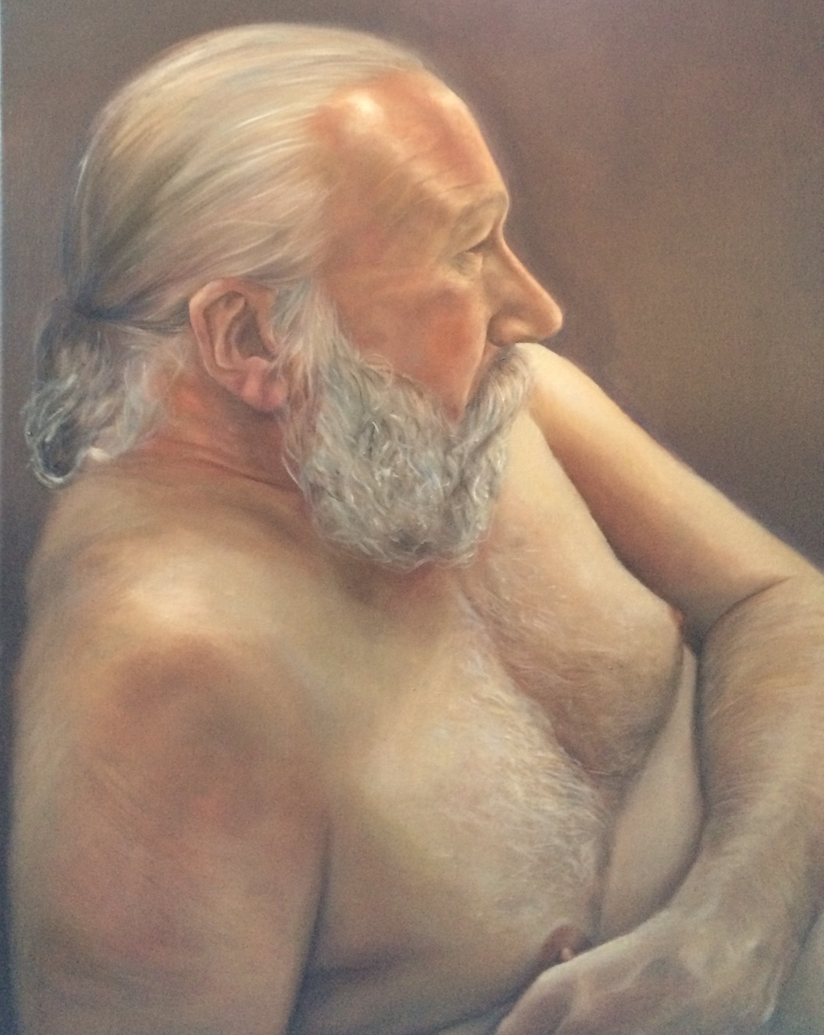
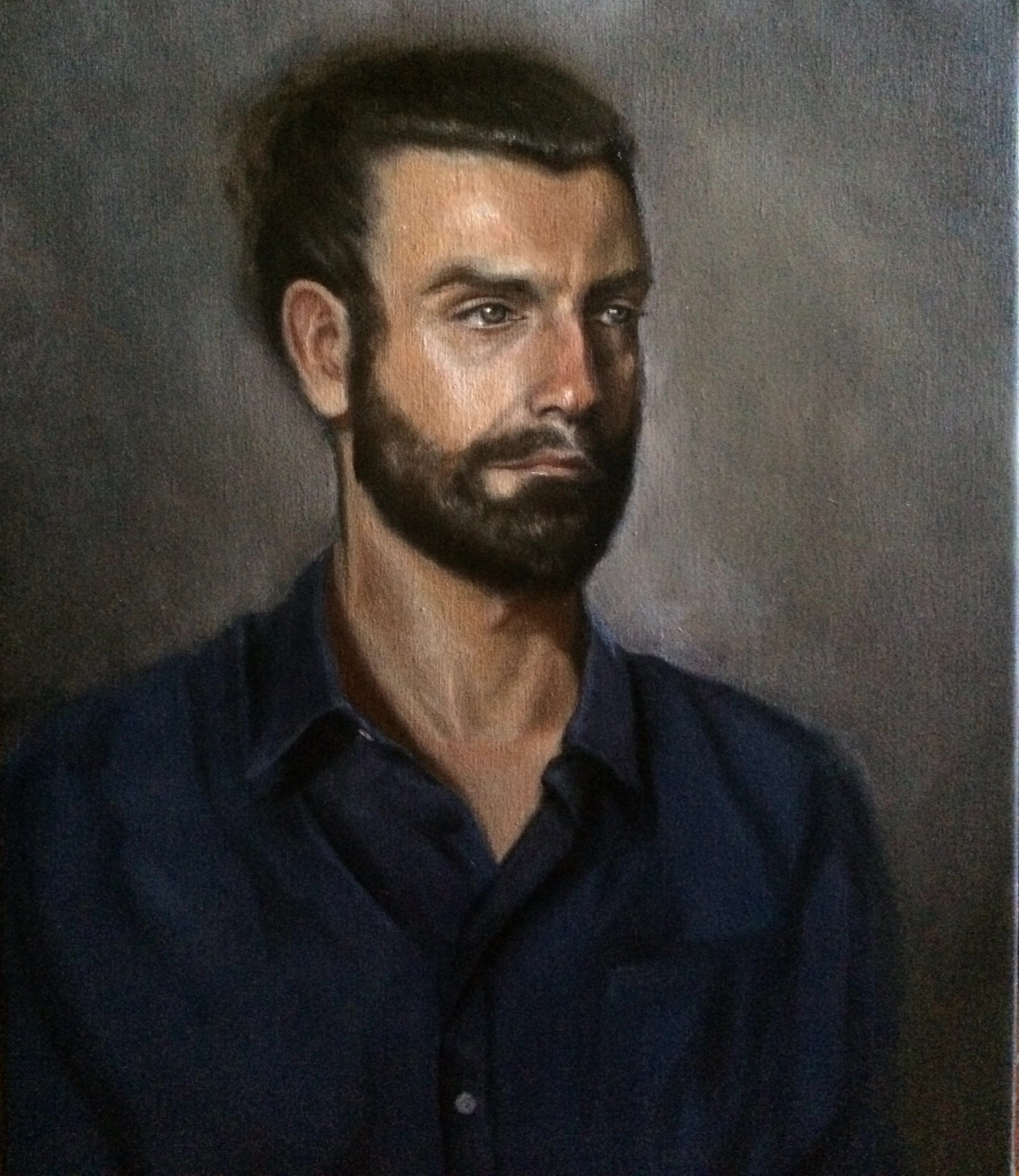
Another drastic change was being limited to only four colours:  an earth red, yellow ochre, ivory black, and lead white. I soon concurred that that the simplicity we were subjected to is seductive, and there is a lot to be said for using an earth-based palette.  Though with all the tempting modern colours that have been created since, I can't imagine sticking within its parameters in the future of my painting, and would probably only use the limited palette as a starting point. 

Under the instruction of Nicholas Beer, my painting took leaps. However, it one cannot deny a great degree of brainwashing that occurs in Florence too. This is not just a way of portrait painting - this is the way.   We are led to believe that this is the creme de la creme, and maybe it is, after all, I greatly admire some of the painters of the Baroque movement for capturing the sitter's psychology, but God forbid, should a Cadmium colour be seen on my palette, far too modern for this place. "Phalo blue - what is that?  Alizarin Crimson - a shocking colour."  If you don't keep yourself under control, you are frowned upon. 

Here is an excerpt from my end of course report:

Her palette became an independent object of wonder; those who encountered it without prior warning 

were often vociferous in their reaction. Sun-glasses should have been provided.


Painted selfie on the Mona Lisa

My self-portrait ("The Morning After") is replicated several times on a giant Mona Lisa.

Click to enlarge, see if you can spot it: 

On Sunday 3rd November, Sky Arts erected Europe's largest Mona Lisa replica on Clapham Common in London to mark the launch of their new show - Portrait Artist of the Year.

Sky Arts: Portrait Artist of the Year

The painting process is a solitary one in the usual course of things. But on Sunday 16th June, I sat in a glass studio, in the centre of Trafalgar square, being the focal point of camera men and passers-by.

I was privileged to take part in the London final of The Sky Arts Portrait Artist of the Year, shortlisted to paint live alongside 20 other artists, producing a portrait in 4 hours. The sitters were Robert Lindsay, Alison Steadman and Juliet Stevenson.

The_Morning_After.JPG

My self portrait (right) was also exhibited on site for the day, alongside other self-portraits.

Frank Skinner and Joan Bakewell presented the show. It will be aired as part of a 6-part series on Sky Arts in late Autumn 2013.


Coffee Art Project - Shortlist

The online gallery of the coffee art project has been launched - click on the image below that will take you through to the website. My entry and its description appears in the shortlisted section. 

The auction of the artworks is scheduled to take place at the London Coffee Ball on the evening of the 26th February 2014 at the Langham Hotel, W1, London.  

Further details will be posted nearer the time.

Art in the City

The Old Trueman Brewery is showcasing The Coffee Art Project, promoting art that links to coffee either conceptually or visually in the most literal sense. The aim of the project is to generate as much coffee-related art as possible, combining these two valued entities. Ultimately, the artworks will be up for auction and sold, with all funds going to Project Waterfall - a charity that raises money for sanitation in coffee producing countries. 

See below for my contribution, featuring my typically anonymous subjects. Title inspired by a Henry Fielding quote, "Love and scandal are the best sweeteners of tea". Oil on linen 12 x 18".

​Love and scandal

If you're interested in seeing it in the flesh, visit in the Dray Walk Gallery at the Old Trueman Brewery, just off Brick Lane, London. Nearest tube: Liverpool Street / Aldgate East. Everyday until 8pm until 21st April, and back again for the London Coffee Festival 25th - 28th April.  


Art about Art

Roy Lichtenstein took cartoons from comic strips and turned them into huge paintings. But he did a lot more than just this - he parodied well-known paintings by famous artists. One series of many being Monet's three Cathedrals, in glaring colours. In short, he slashed the dominant art movement at the time, no doubt annoying Jackson Pollock, Lee Krasner, Willem de Kooning, Mark Rothko et al. Abstract expressionism was the thing in the late 1950s, and after experimenting with it for a brief period, Lichtenstein moved on to pop art, alongside Andy Warhol. Art as a noble means of communication, surpassing all spoken languages, a universal entity, open to analysis of form and stroke, is here replaced with thick black contours and blocks of psychedelic yellow, red and ultramarine blue. And plenty of dots. 

The Tate Modern is showcasing a retrospective marking Lichtenstein's legacy. The age of mechanical reproduction is reflected in Lichtenstein's replicas, playing on our conceptions of authorship and dizzying our eyes. Also on show are his gold sculptures that look like they've just been chopped off Manhattan's Chrysler building, and surprisingly loosely painted sketches that demonstrate tremendous influence from Picasso. 

As for Lichtenstein's life: he was born in NYC into a Jewish American family and his father was a real estate broker. Fame came in his mid 30s, after taking up art academically and teaching it too. Albeit he received criticism for his style and subject matter straying from 'meaningful art'. Aerosol sprays, toast, domestic scenes, Mickey Mouse, lemons, perfectly proportioned men and women experiencing shallow distress. What's not to like? Exhibition on until 27th May.

So Close yet so far away

Chuck Close has been represented by the White Cube gallery in London since 1999, a couple of decades after his success spiraled in the New York galleries. His work is still vastly exhibited in New York, mainly in Mid-town Manhattan, not just in the large galleries but also in the smaller, inconspicuous ones scattered around Madison Avenue. It is worth seeing the exhibition currently on at the White Cube in London, while it's here, even if it means having to make a trip to Bermondsey. The gallery space is big and airy, perfect for Chuck Close's work. Chuck Close has such a great name that I do not even feel compelled to refer to him just as 'Close' hereafter. 

​Chuck Close, self-portrait

Anyway, Chuck Close produces massive portraits - larger than life portraits - some of which are incredibly realistic. He is affiliated with photo-realism, a movement that sprang up in the late 1960s and early 1970s in America and Europe. The movement was an offshoot of pop art, dominated by painters who essentially gave a visual ode to photography by basing their paintings on photographs. Photo-realists work so closely with a photograph at hand, that at first glance their finished pieces look astonishingly photographic. 

There are certain things you get when painting from a photograph that you do not get when painting from its equivalent still life. That's why there is no point in arguing that one practice is superior to the other. I suppose this is what I find most interesting about photo-realism, which prompts me to paint distorted photographs that capture surreal effects. Chuck Close appears to have been taken by pixels - the 'pixelated' self. Our minds instinctively accept photographs as a form of reality, and in print photographs are made up of thousands of pixels, in four colours (cyan, magenta, yellow and black).

Chuck Close focuses on the blur of a photograph, and creates all his prints and paintings by hand. You can learn about some of his methods at the exhibition, and gain an insight into the print-making process. The grid method is used to preserve accuracy - but do not for a second assume he relies on computers. He is far too earthy for that. After his physical collapse in 1988, which he calls 'the event', he carried on painting by strapping a paintbrush to his wrist. It should be noted that he often takes an experimental approach to layering paint onto surfaces, at one point abandoning the paintbrush entirely. Instead, he used his fingers and stamp prints, waiting for each layer to dry before commencing another over it. 

The experience you get of Chuck Close can be quite technical. The very pixelated, dotted portraits are almost abstract and strip away the possibility of an emotional connection with the subject. The sharper images look more consolidated, but either way it depends on how far back you are standing. The irony is that Chuck Close has prosopagnosia - the inability to recognise faces - yet he spends so much time representing faces, taking close up pictures of them. He describes his portraits as having ‘a sharp focus data within a sandwich of blur’. Perhaps commonly known to us as being so close yet so far away. Exhibition on until 21st April.

Manet at the RA

​Emile Zola

Édouard Manet's portraits are being exhibited at the Royal Academy. Manet, born 1832 into a bourgeoisie family in Paris, led the transition from realism to impressionism. It may not seem so at first glance, but he was rather ahead of his time. You can tell by his frequent use of Ivory black. On the whole, the impressionists had used black more sparingly than he did.

Between Man Ray and Manet, whose current London exhibition features more celebrities? Man Ray captures a satisfying scope of them on camera, from Picasso to Duchamp (see review), but shifting backwards to the previous century, we can see that Manet painted a fair few of his time, and his confident, masterful use of black paint - his trademark - comes through in each of these paintings. By the looks of things, many of his friends (well, at least the ones he chose to paint), were highly acclaimed novelists and poets. 

The Gare Saint-Lazare

These portraits are unconventional in more ways one; for example look at The Gare Saint-Lazare  (The Railway), where the child in the painting has her back to the viewer. We've seen artists like Gerhard Richter presenting subjects like this, withholding emotional an connection, but it is quite a modern concept. 

When this painting was displayed at the Salon of 1874, it had received mixed reviews and remarks such as, “Is Manet’s Railway a double portrait or a subject picture? We lack the information to solve this problem.” And as Richard Dorment aptly puts it: that’s the whole point. 

Westminster-20130209-01518.jpg

Another well-known piece, Music in theTuileries was regarded as unfinished by some, and when you stare at it for long enough, it is not hard to see why. Look at this section of painting (right).

When you extract it from the overall painting, it looks a mishmash. Is the one by the tree trunk a face in the crowd Manet thought we would not notice? Maybe it is not supposed to be a face - I hope not. 

​Music in the Tuileries

Still, the depicted atmosphere of the gardens are effectively communicated, the crowd and green mesh of the trees appear endless. And those top hats just exude a sense of euphoria.  Manet's works, finished or unfinished, have a lasting impact. He manages to lure us in with his casual, immediate, loosely applied wide brush-strokes. Every stroke has a clear purpose of colour.

My last remarks are about the production of the exhibition itself. It is curated in a curious way. Whilst each painting is inherently faultlessly displayed, they are either crammed in side by side or, in a couple of the smaller rooms, very sparsely dispersed. Music in the Tuileries was given an entire wall, and an entire room, to itself - a whole room. I know it is one of his important pieces but still. Really? The set up is a bit of a maze too. I would not recommend going on a weekend if you can avoid it - very crowded and there is likely to be a ticket queue (unless you have pre-booked or are a 'friend' of the RA - I certainly became one after seeing the queue on a rainy Saturday afternoon). Heavily marketed though, since its opening, Manet's name has been everywhere. I even had a Manet print on my coffee cup from Paul's. Nice. Exhibition on until 14th April.

Faces, symmetry, Man Ray

Painting, drawing, and sculpting the representation of a face - the mathematics of a face. I love painting people because as much as you can mess with folds in linen, there's no meddling with someone's facial structure. Not even by a millimetre. Or rather: especially not by a millimetre. As for particular face types, instinctively we tend to appreciate symmetrical faces, simply due to the fact that we are innately attracted to symmetry. 

Man Ray can tell you the same thing; except not only did he paint symmetrical faces, he photographed them. See his iconic photograph of Catherine Deneuve (1968) below. 

​Catherine Deneuve

This was no spontaneous point and shoot. Man Ray was heavily involved in the staging process of framing a face. He designed Denueve's elongated earrings himself, as spirals hanging in harmony with the curves of her hair, and painted, in what appear to be Picasso-esque brush strokes, directly onto the boards in the background. The over-sized hardback book is placed at a slight angle on the chess board, almost as if by coincidence. In reality, this was all careful consideration. 

Man Ray was born in America, lived mainly in Paris and contributed to the Dada movement in the 1920s - 30s. His other photographic subjects include Lee Miller, Marcel Duchamp, Pablo Picasso, Kiki de Montparnasse and Virginia Woolf. He even seems to have applied the 'stream-of-consciousness' as a visual practice, as an opposition to chronological order. 

Although not bearing glitches in the realm of photography, Man Ray cared about the impression of his paintings too. In his studio on the rue Ferou, he actually begun his career as a surrealist painter and then moved on to use a range of other mediums. But, even so, he inevitably became best known for avant-garde photography. A "second violin" in his life, "just as necessary in the orchestra as the first violin". His own words. 

The French intellectuals of his time had a lot to say about photography too. Roland Barthes wrote an entire book on the subject. 

“Ultimately — or at the limit — in order to see a photograph well, it is best to look away or close your eyes. 'The necessary condition for an image is sight,' Janouch told Kafka; and Kafka smiled and replied: 'We photograph things in order to drive them out of our minds. My stories are a way of shutting my eyes.” 

― Roland Barthes, Camera Lucida: Reflections on Photography

The National Portrait Gallery is exhibiting Man Ray's photographic portraits for the first time, until 27th May 2013. 


Introduction

Before starting my first blog-post, I'm laying out a few preliminaries: I'm not going to be posting excessively, nor will my posts be particularly long. But, hopefully they will be interesting. A friend yesterday told me he hates blogs - why? - I don't really care what people have to say. Blogs are self-indulgent. Are you going to start one? - Absolutely not, I said. And here I am. 

As explained in the 'about' section of this website, I am a London-based artist, with a variety of interests though my current focus is portrait painting. I have taken on commissions and still do, subject to timing.

My academic background is in philosophy and literature. I am originally Iranian, explaining the number of exotic looking people in my portrait collection.